How Printed News Learned to Direct the Eye
Trace how printed news moved from public broadsides to newspaper front pages, and learn to separate a page’s visual emphasis from a story’s evidence.
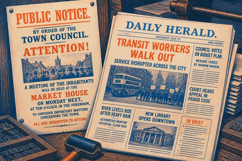
A large notice posted in a public place had to catch the eye before anyone walked on. Printed news later placed many items on one page, making the editor’s choices about position and prominence harder to miss. The history of broadsides and newspaper front pages helps readers distinguish visual emphasis from evidence.
There was no single path from one format to the other. Broadside printing, early newspapers, and later front pages varied by place, publication, and period. The point is not that design steadily improved, but that each format gave publishers different ways to direct attention.
What could a broadside make readers notice?
A broadside was a sheet printed on one side, often displayed in a shared public place such as a street, market, or church door. It could carry a proclamation, public notice, warning, or report. People did not need to buy a newspaper or turn a page to encounter it.
Because the sheet had no neighboring stories competing for space, its heading, illustration, or opening could give a single item strong visual emphasis. That emphasis served different purposes: a notice might ask people to gather, obey, buy, or pass information along. A commanding appearance invited attention; it did not establish whether the claim was reliable.
When examining a broadside, ask what action its wording and display seem designed to prompt. The answer can clarify the document’s purpose without settling whether its claims are true.
How did a newspaper page change the choice?
A newspaper placed multiple items together. Readers now had to choose among them, while publishers had to decide which stories appeared first, where they sat, and how they were separated.
Early newspapers did not all use the front-page structure familiar today. For example, London’s Daily Courant, first published in 1702, presented news in a compact, column-based format; later papers used a broader range of typographic and page-design choices. The comparison is a limited illustration, not a claim that every newspaper followed the same sequence. Printing methods, local practice, available space, and publication schedules all shaped the page.
Even in dense layouts, ordering mattered. A story near the top of a column could meet the eye before one farther down. Separation, headings, and placement gave readers cues about where to begin, though they could not tell readers how well a claim was supported.
How do headlines and type create hierarchy?
Headlines, type size, rules, white space, and illustrations can distinguish one item from another. A brief bold heading may be legible at a glance. A smaller heading can signal a short item, a continuation, or simply a space constraint.
Visual hierarchy is an editorial cue, not a neutral ranking of truth or public importance. A prominent story may reflect an editor’s judgment about timeliness, but the layout can also be shaped by column width, story length, and what else must fit on the page. A compressed headline may simplify a complicated report because it has little room to explain qualifications.
Notice what the design invites you to read first, then compare that invitation with the article’s claims and sources. If the headline sounds more certain than the reporting, the gap is a useful clue about framing.
What does the front page show—and leave out?
A front page is a selection, not a complete record of events. Editors choose which items appear, how much room they receive, and what sits beside them. Prominent placement shows that a publication has chosen to foreground a story; it does not prove the story matters most in every sense or that the page covers all relevant information.
That selection depends on context. A local paper may lead with a municipal decision that a national paper gives little space. Different editions of the same publication may also present material differently. A page records editorial choices for a particular audience and moment, not a universal ranking of events.
Say you see a large headline about a transit dispute beside smaller notices about a council vote and a court hearing. You read the transit story first, then check whether its headline matches the article’s details, read the notices, and look for reporting that clarifies the dispute. The likely result is a better view of what the page emphasizes and what it leaves outside the frame—not proof that the layout caused a particular response.
How can you read layout without following it blindly?
Start with the arrangement, then assess the claims. For each observation, make a decision about what to read or check next:
- Position: If an item is high on the page, read it early but do not treat its placement as evidence; if it is buried or continued elsewhere, locate the full item before judging its prominence.
- Type and space: If a large headline or image makes a story stand apart, compare that emphasis with the article’s subject; if space is limited, check whether the story is shortened or continued.
- Headline and article: If the headline makes a definite claim, look for the supporting details in the article; if the wording overstates them, rely on the narrower account until you can trace the claim.
- Neighboring items: If nearby stories appear connected, check whether their text states a connection; if it does not, do not infer one from proximity alone.
- Edition and date: If these details are available, identify them before comparing pages; if they are missing, treat claims about timing or audience as uncertain.
- Named sources: If a claim names a source, follow it where possible and assess what it actually supports; if no source is given, seek another account before repeating the claim as established.
These checks do not require treating design as a trick. A page has to organize information, and clear cues can help readers find it. The useful habit is to notice how the design guides attention, then make a separate judgment about the reporting.
What do readers ask about broadsides and front pages?
What was a broadside?
A broadside was a sheet printed on one side, often displayed in a public place. It could carry a notice, proclamation, warning, or report, and its display helped attract attention.
Did newspapers always have a modern front page?
No. Newspaper layouts varied by period and publication. The modern front page hierarchy developed over time, rather than appearing in a single standard form.
Does a front-page headline prove a story matters most?
No. Placement indicates a publisher’s choice about prominence, not a final measure of public importance or factual support. Read the report and assess its evidence separately.
Why does page layout matter to news literacy?
Layout affects what readers notice first and what may be overlooked. Recognizing that influence helps separate editorial emphasis from the strength of a claim.
Printed news offers a visible record of how a publisher chose to introduce information. Reading the page alongside the reporting—and tracing claims to their sources—keeps that choice in view without mistaking it for proof.